A wide product in a vertical ad: one key visual, eight formats
Updated November 2026 · PixFit team
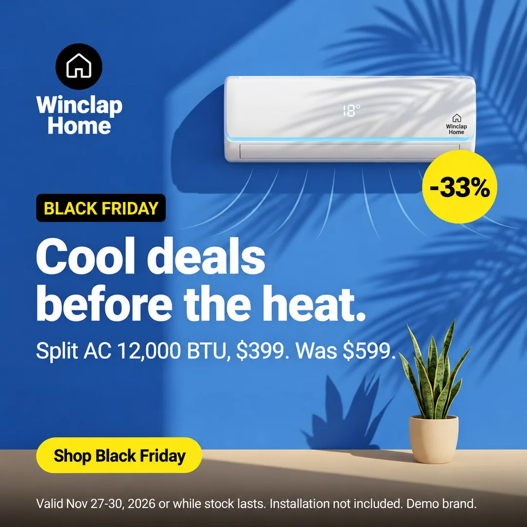
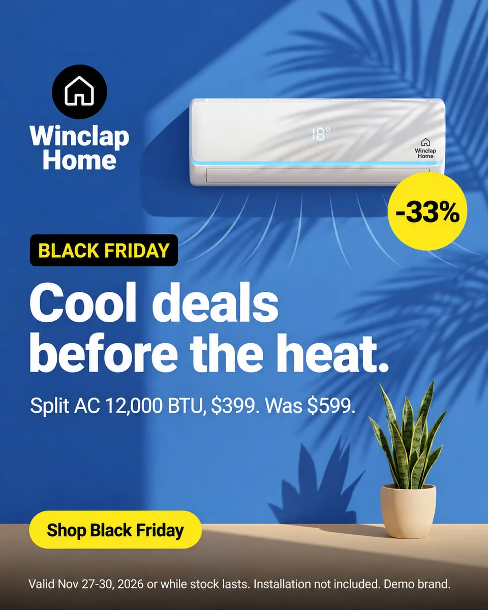
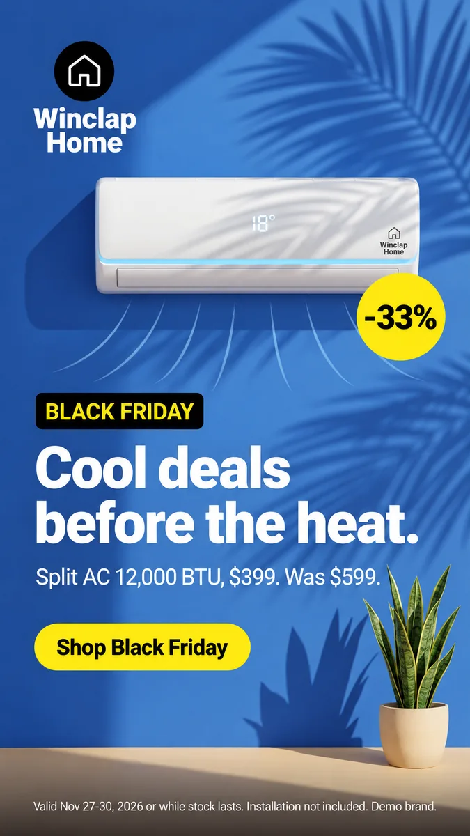
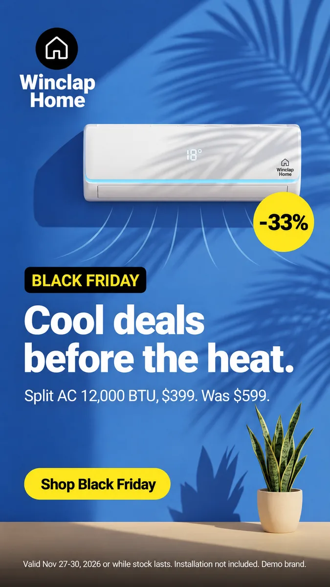
A wide product fits a tall frame by shrinking, not by being cropped. In this real example, a demo-brand air conditioner on a square key visual became eight outputs, from 16:9 to 9:16. The price, the badge, the button and the legal line stayed on every one, and the unit stays fully in frame in the tall ones.
Landscape products are the hard case for vertical placements. A long sofa, a banner or an air conditioner shrinks in 9:16, and the text around it has to shrink with it or the ad turns into a thin strip.
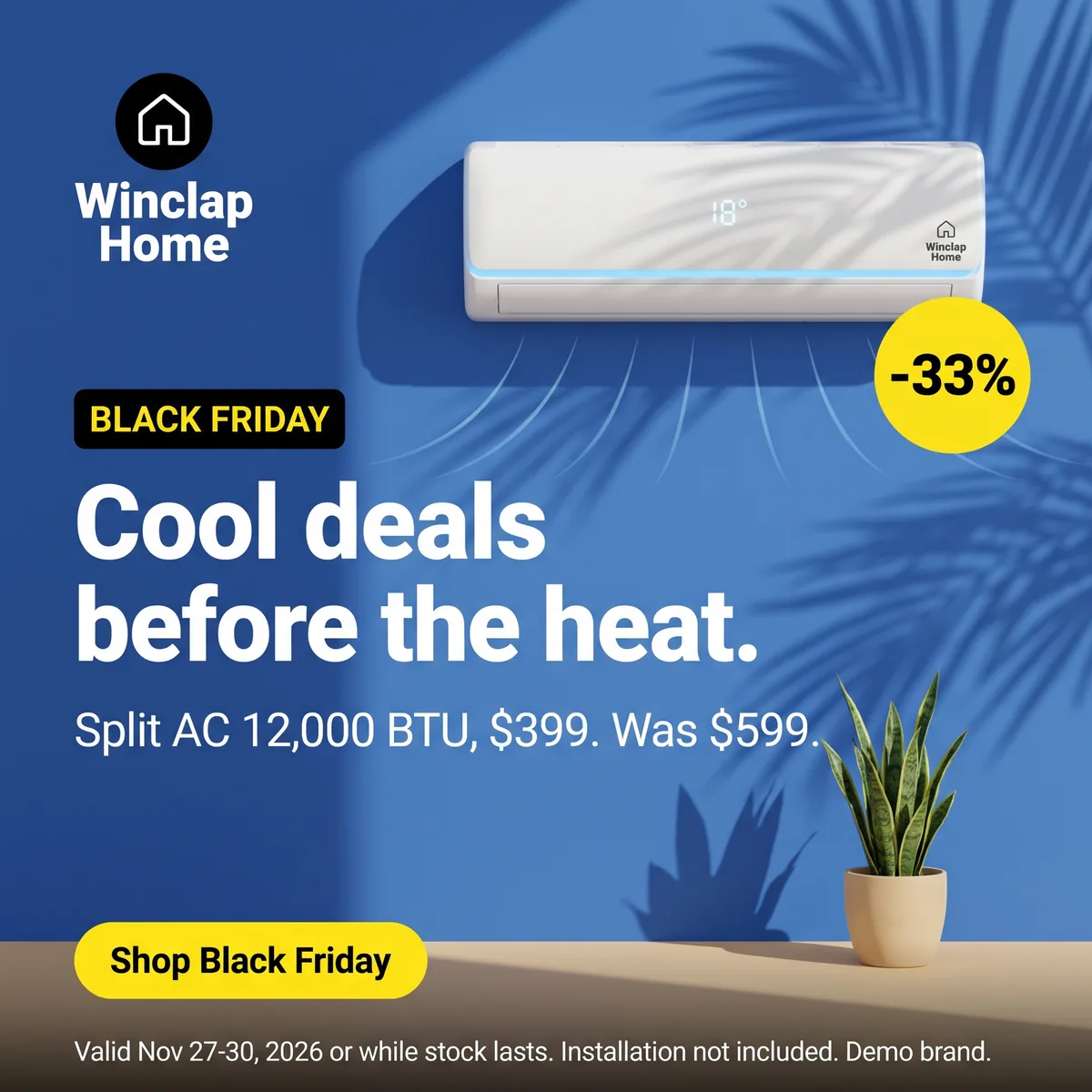 Key visual · 2048 × 2048
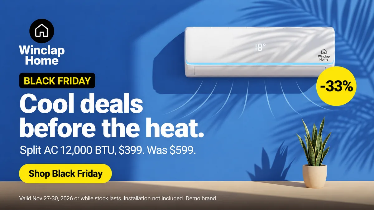 Google 16:9 · 1920 × 1080
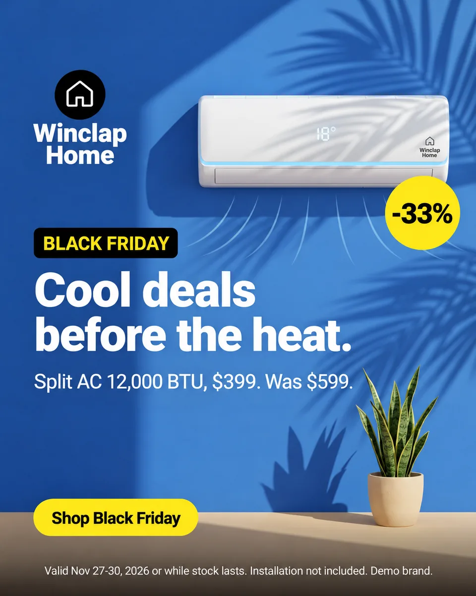 Meta 4:5 · 1200 × 1500
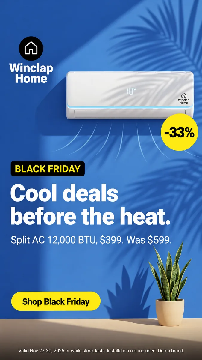 Meta 9:16 · 1080 × 1920
Winclap Home (demo brand): the eight outputs, with what the platform recommends and what PixFit produced
| Placement | Platform recommends | PixFit output | What to check on a wide product |
|---|---|---|---|
| Meta Feed 1:1 | Not the ratio the Ads Guide pages cited recommend | 1080 × 1080 | Unit and price line fit the square without crowding |
| Meta Feed 4:5 | 1440 × 1800 | 1200 × 1500 | Unit is full width; headline sits below it |
| Meta Stories and Reels 9:16 | 1440 × 2560 | 1080 × 1920 | Unit is smaller; legal line is the smallest text |
| Google Demand Gen 1:1 | 1200 × 1200 | 1080 × 1080 | Same layout as the key visual |
| Google Demand Gen 4:5 | 960 × 1200 | 1080 × 1350 | Unit is full width; badge stays on the unit |
| Google Demand Gen 9:16 | 1080 × 1920 | 1080 × 1920 | Unit is smaller; legal line is the smallest text |
| Google 16:9 | Video ratio; not an image size in the pages cited | 1920 × 1080 | Text and unit sit side by side, larger |
| TikTok In-Feed 9:16 | 720 × 1280 template frame | 1080 × 1920 | Unit is smaller; button stays readable |
Platform columns are official recommendations read on 6 November 2026; PixFit columns are what the tool produced. The key visual is a 1:1 image with a 33% badge and the legal line “Valid Nov 27-30, 2026 or while stock lasts. Installation not included. Demo brand.”
Sources
- Meta Ads Guide: Facebook Feed image, accessed 2026-11-06
- Meta Ads Guide: Instagram Stories image, accessed 2026-11-06
- Google Ads Help: Demand Gen image specs, accessed 2026-11-06
- TikTok Business Help Center: TikTok Auction In-Feed Ads, accessed 2026-11-06
- Key visual · 2048 × 2048
 Meta 1:1 · 1080 × 1080
- Meta 4:5 · 1200 × 1500
- Meta 9:16 · 1080 × 1920
 Google 4:5 · 1080 × 1350
 Google 9:16 · 1080 × 1920
- Google 16:9 · 1920 × 1080
 TikTok 9:16 · 1080 × 1920
The brief: a unit that is three times wider than tall
Winclap Home is a demo brand. The key visual shows a split air conditioner high on a blue wall, a plant on a shelf, the headline “Cool deals before the heat.”, the line “Split AC 12,000 BTU, $399. Was $599.”, a yellow “-33%” badge, a “Shop Black Friday” button and a legal line. The product is wide, so the tall formats are the test.
What changes between 16:9 and 9:16
In 16:9 the unit and the text sit side by side and both are large. In 4:5 the unit spans the width and the text goes below. In 9:16 the width is fixed at 1080 pixels, so the unit is smaller and the headline, price line and button are stacked under it. The same elements are on every output. What changes is their size and position.
What we checked, and what we left out
We compared every output with the key visual. All eight showed the unit in full, the badge, the button and the legal line. Two checks were extra: the right edge of the 9:16 and the legal line, which is the smallest text in the tall formats. We also asked for two strips that are wider than 4:1. PixFit does not offer ratios beyond 4:1 on public pages, and the 728-pixel-wide strip cropped the unit, so we left those two out of this example and they are not shown. The eight above are exactly as PixFit delivered them.
How to review a wide product before you upload
Look at the tall outputs first. Check that the unit is not cut at the edges, that the price line is still readable at phone size and that the legal line is complete. PixFit is built to keep the logo, price, button and legal line, and it can show a safe-zone overlay so you can check each output at a glance. If something sits in a strip a platform reserves for its own interface, move it with layers or an AI fix before you publish.
How PixFit adapts one key visual
- 1
Upload the approved key visual (PNG, JPG or WebP).
- 2
Pick the formats: 14 presets plus any custom size.
- 3
Review each output with the safe-zone overlay, finish any detail with AI fixes and download it ready for paid media.
Frequently asked questions
What a designer spends 2 days on takes PixFit under 3 minutes.
Plans from $49/mo. Start with 5 free credits, no card.
See pricing