Car rental ad sizes: one key visual, ten formats, headline contrast measured
Updated November 2026 · PixFit team
A car rental campaign needs a landscape, a 4:5, a square, a vertical and a display size from one photo. This page shows one real set from a demo brand, Winclap Drive: 10 PixFit outputs, each platform's recommended size next to ours, and the contrast of the white headline measured in every output.
A bright coastal sky is the hardest background for white type, and every new format moves the headline onto a different patch of it. The question is not only which sizes to make. It is whether the headline is still readable in each one.
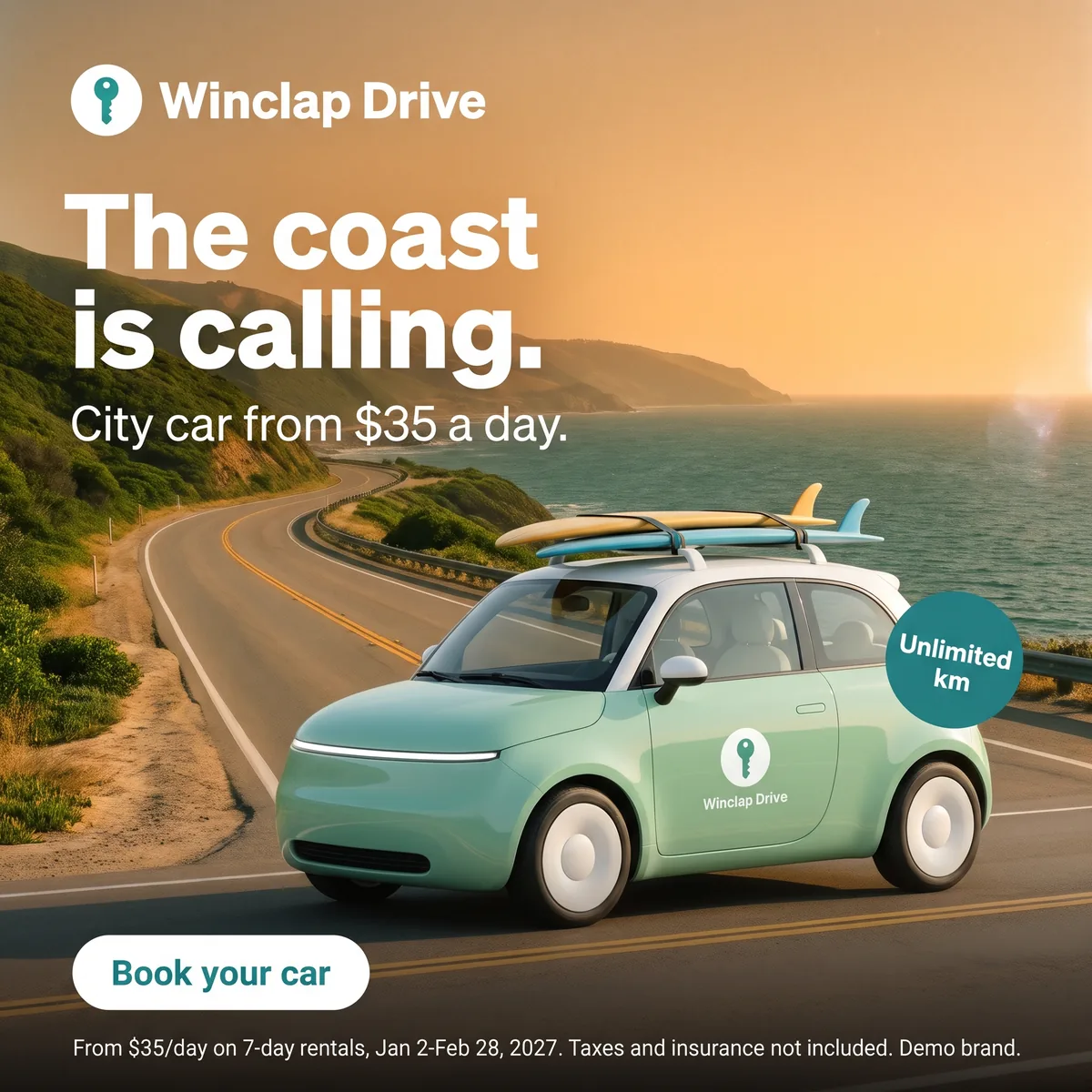 Key visual · 2048 × 2048
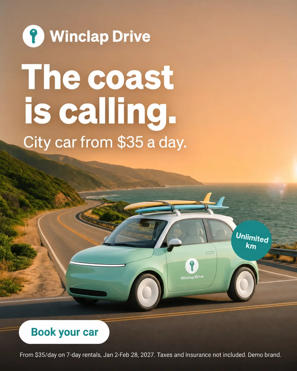 Meta 4:5 · 1200 × 1500
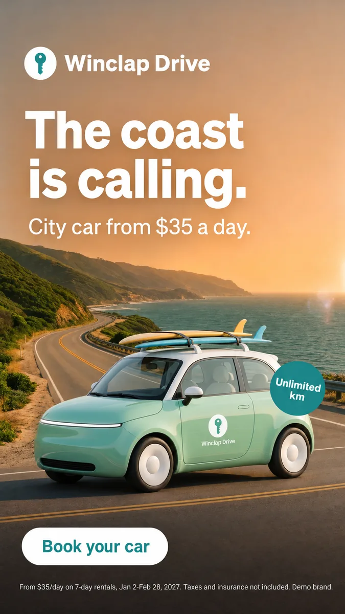 Meta 9:16 · 1080 × 1920
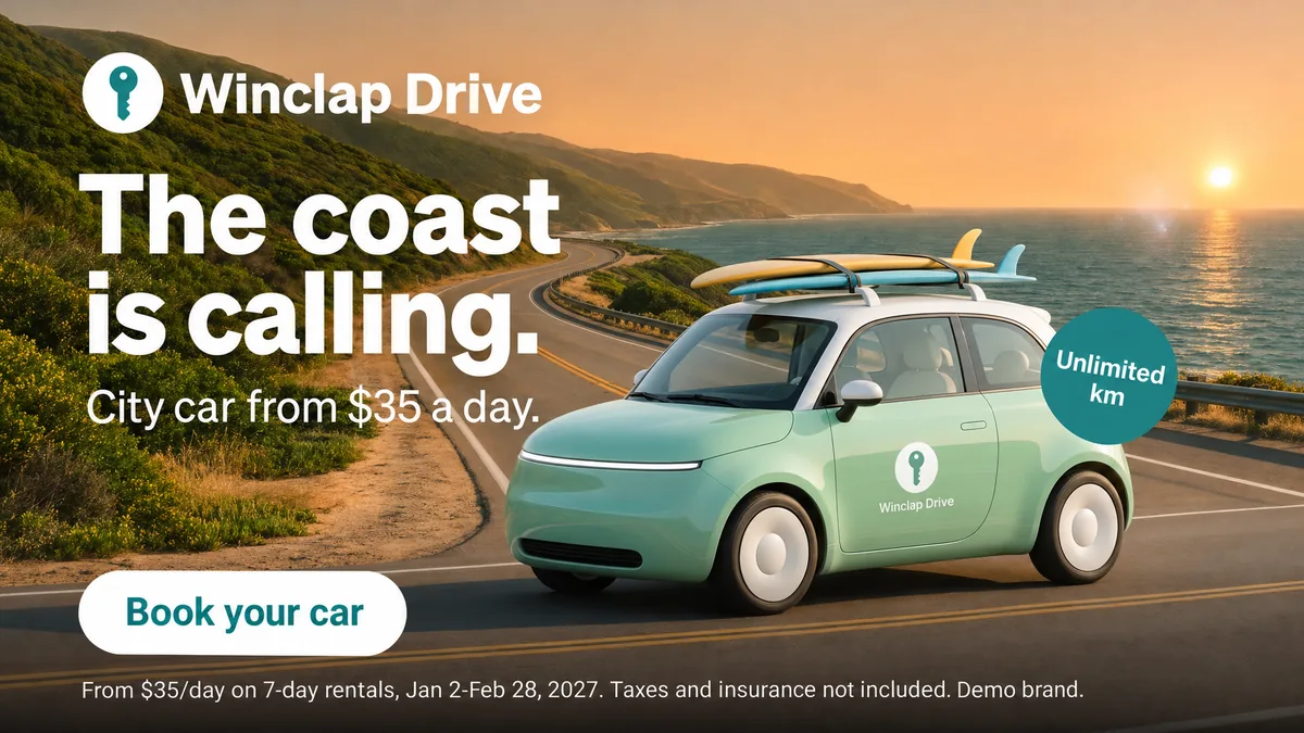 Google 16:9 · 1920 × 1080
Winclap Drive (demo brand): official recommendation, PixFit output and measured contrast of the white headline
| Placement | Platform recommends | PixFit output | Headline contrast |
|---|---|---|---|
| Meta Feed 4:5 | 1440 × 1800 | 1200 × 1500 | 3.1 to 1 |
| Meta Stories and Reels 9:16 | 1440 × 2560 | 1080 × 1920 | 3.0 to 1 |
| Meta Feed 1:1 | Not the ratio the Ads Guide pages cited recommend | 1080 × 1080 | 4.0 to 1 |
| Google Demand Gen 1:1 | 1200 × 1200 | 1080 × 1080 | 3.8 to 1 |
| Google Demand Gen 4:5 | 960 × 1200 | 1080 × 1350 | 3.1 to 1 |
| Google Demand Gen 9:16 | 1080 × 1920 | 1080 × 1920 | 3.0 to 1 |
| Google landscape 1.91:1 | 1200 × 628 | 1200 × 628 (custom size) | 10.2 to 1 |
| Google Display, medium rectangle | 300 × 250 | 300 × 250 (custom size) | 5.2 to 1 |
| Google 16:9 | Video ratio; not an image size in the pages cited | 1920 × 1080 | 9.9 to 1 |
| TikTok In-Feed 9:16 | 720 × 1280 template frame | 1080 × 1920 | 3.1 to 1 |
Contrast is white text against the pixels behind it, measured by us on each output on 6 November 2026. The key visual itself measures 4.5 to 1. The W3C accessibility guideline asks for 3 to 1 for large text; it is a web reference, not an ad-platform rule.
Sources
- Meta Ads Guide: Facebook Feed image, accessed 2026-11-06
- Meta Ads Guide: Instagram Stories image, accessed 2026-11-06
- Google Ads Help: Demand Gen image specs, accessed 2026-11-06
- Google Ads Help: uploaded display ads specifications, accessed 2026-11-06
- TikTok Business Help Center: TikTok Auction In-Feed Ads, accessed 2026-11-06
- W3C WCAG 2.2: Contrast (Minimum), accessed 2026-11-09
- Key visual · 2048 × 2048
- Meta 4:5 · 1200 × 1500
- Meta 9:16 · 1080 × 1920
- Google 16:9 · 1920 × 1080
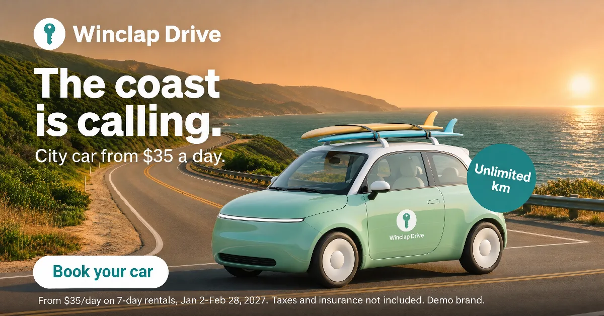 Google 1.91:1 · 1200 × 628 · custom size
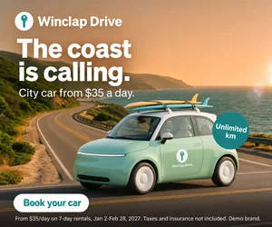 Display 300 × 250 · 300 × 250 · custom size
The brief: one photo, a rental offer, every placement
Winclap Drive is a demo brand we made to show PixFit on a real rental campaign. The key visual is a 1:1 image of a small green city car on a coastal road at sunset, with a white headline (“The coast is calling.”), a price line (city car from $35 a day), an “Unlimited km” badge, a “Book your car” button and a legal line with dates, taxes and insurance. That is the kind of piece a rental team approves once and then needs in every size.
Where the headline went in each format
The headline is white and the sky is bright, so its position matters more than its size. PixFit moved it with the format. In the tall formats (9:16 and 4:5) the text rises into the open sky, where the contrast is lowest, about 3 to 1. In the wide formats (16:9, 1.91:1) it drops onto the green hills, about 10 to 1, and the sun sits to the right, away from the text. In every output the headline stayed clear of the sun.
- Tall formats: headline in open sky, about 3 to 1, readable at real size.
- Wide formats: headline over the hills, about 10 to 1.
- Square: 4.0 to 1 in Meta and 3.8 to 1 in Google.
What we left out, and the weak spot
We generated one extra strip wider than 4:1. It lost the “Unlimited km” badge, so we did not use it and it is not shown here. PixFit publishes ratios up to 4:1 only. The other weak spot is the subhead: in the 9:16 and 4:5 outputs it measures about 2.7 to 1, under the 3 to 1 reference, because it sits in the same bright sky as the headline. It reads at real size, but it is the line to check first. We kept the outputs as generated and did not retouch them by hand.
How to run it in PixFit
Upload the key visual, pick the Meta, Google and TikTok presets, and add the two sizes that are not presets (1200 × 628 and 300 × 250) as custom sizes. Then put each output next to the key visual and check logo, price, badge, button and legal line one by one. PixFit is built to keep them, and the check is how you know. Teams that want to see where the platform interface covers an output can switch on the safe-zone overlay.
How PixFit adapts one key visual
- 1
Upload the approved key visual (PNG, JPG or WebP).
- 2
Pick the formats: 14 presets plus any custom size.
- 3
Review each output with the safe-zone overlay, finish any detail with AI fixes and download it ready for paid media.
Frequently asked questions
What a designer spends 2 days on takes PixFit under 3 minutes.
Plans from $49/mo. Start with 5 free credits, no card.
See pricing